> For the complete documentation index, see [llms.txt](https://lizh.gitbook.io/knowledge/llms.txt). Markdown versions of documentation pages are available by appending `.md` to page URLs; this page is available as [Markdown](https://lizh.gitbook.io/knowledge/css-xi-lie/00css-ying-yong-shi-li-02.md).
# CSS应用示例02
## 等高布局
等高布局是指子元素在父元素中高度相等的布局方式。
### 伪等高:padding+margin
背景色是在 `padding` 区域显示的,设置一个大数值的 `padding-bottom`,再设置相同数值的负的 `margin-bottom`,使背景色铺满元素区域,又符合元素的盒模型的计算公式,实现视觉上的等高效果。
```css
.box_01 {
overflow: hidden;
font-size: 0;
}
.box_01 .equal_height {
display: inline-block;
width: 200px;
padding: 15px;
vertical-align: top;
margin-bottom: -300px;
padding-bottom: 300px;
box-sizing: border-box;
font-size: initial;
}
```
[伪等高:padding-bottom和负margin-bottom DEMO](https://1927344728.github.io/demo-lizh/html/24-equal_height_layout.html?type=1)
### 伪等高:边框模拟
用父元素左右边框伪装左右两个兄弟元素的背景色,然后将将两个透明背景的元素使用绝对定位覆盖在父元素的左右边框上,实现视觉上的等高效果。
**注意:** 左右两侧元素的内容高度不能大于中间元素内容高度。
```css
.box_02 {
position: relative;
padding: 0;
border-left: 200px solid sandybrown;
border-right: 200px solid slateblue;
box-sizing: border-box;
}
.box_02 .equal_height {
width: 200px;
padding: 15px;
box-sizing: border-box;
}
.box_02 .equal_height:nth-child(1) {
position: absolute;
left: -200px;
top: 0;
}
.box_02 .equal_height:nth-child(3) {
position: absolute;
right: -200px;
top: 0;
}
```
[伪等高:边框模拟 DEMO](https://1927344728.github.io/demo-lizh/html/24-equal_height_layout.html?type=2)
### table-cell
表格的一个特性:所有单元格高度都相等。
```css
.box_03 .equal_height {
width: 33.33%;
display: table-cell;
}
```
[table-cell DEMO](https://1927344728.github.io/demo-lizh/html/24-equal_height_layout.html?type=3)
### absolute+padding
用 `position: absolute` 设置子元素的top:0;bottom:0;使得所有子元素的高度都和父元素的高度相同,实现等高效果
```css
.box_04 {
position: relative;
width: 200px;
padding: 0 200px;
}
.box_04 .equal_height {
width: 200px;
padding: 15px;
box-sizing: border-box;
}
.box_04 .equal_height:nth-child(1) {
position: absolute;
left: 0;
top: 0;
bottom: 0;
}
.box_04 .equal_height:nth-child(3) {
position: absolute;
right: 0;
top: 0;
bottom: 0;
}
```
[absolute+padding DEMO](https://1927344728.github.io/demo-lizh/html/24-equal_height_layout.html?type=4)
### flex
flex 盒子下的子项目高度默认为父元素的高度。
```css
.box_05 .container {
display: flex;
flex-direction: row;
}
.box_05 .container .equal_height {
flex: 1 1 33.33%;
padding: 15px;
box-sizing: border-box;
}
```
[Flex DEMO](https://1927344728.github.io/demo-lizh/html/24-equal_height_layout.html?type=5)
### grid
grid(网格) 布局的每一行的单元格高度默认相等。
```css
.box_05 .container {
display: grid;
grid-template-columns: repeat(3, 33.33%);
grid-template-rows: 100%;
}
.box_05 .container .equal_height {
padding: 15px;
}
```
[Grid DEMO](https://1927344728.github.io/demo-lizh/html/24-equal_height_layout.html?type=6)
## 百分比环形图
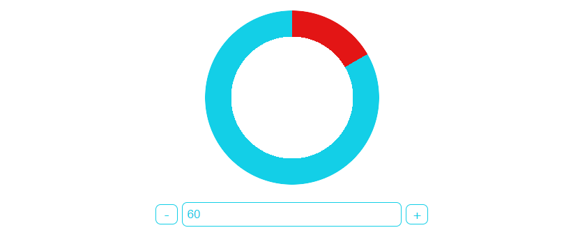
**方法一:** 绝对定位 + 旋转。
```html
```
[查形绝对定位 + 旋转DEMO](https://1927344728.github.io/demo-lizh/html/00-css.html?type=2)
**方法二:** 锥形渐变。**注意浏览器兼容性。**
```html
```
[查形锥形渐变DEMO](https://1927344728.github.io/demo-lizh/html/00-css.html?type=3)