> For the complete documentation index, see [llms.txt](https://lizh.gitbook.io/knowledge/llms.txt). Markdown versions of documentation pages are available by appending `.md` to page URLs; this page is available as [Markdown](https://lizh.gitbook.io/knowledge/css-xi-lie/05css-tan-suo-xi-lie-lineheight.md).
# CSS探索系列 Line Height
line-height,又称行高,具体来说是指两行文字间基线间的距离,也可以称为一行文字所占的高度。在CSS,line-height 被用来控制行与行之间的垂直距离。
## 常规使用
line-height CSS 属性用于设置多行元素的空间量,如多行文本的间距。**对于块级元素,它指定元素行盒的最小高度。对于非替换内联元素,它用于计算行盒的高度。**
> 替代的 inline 元素:img、iframe、video之类的由加载资源决定显示尺寸的元素。
line-height 属性被指定为以下任何一个:
* normal: 取决于用户端。桌面浏览器(包括Firefox)使用默认值,约为1.2,这取决于元素的 `font-family`。
* **数字(推荐)**: 无单位数字,<数字>乘以该元素的字体大小。
* 长度: 以em、px、rem等为单位的值。
* 百分比: 与元素自身的字体大小有关。计算值是给定的百分比值乘以元素计算出的字体大小。
## 基本概念
### 顶线、中线、基线、底线
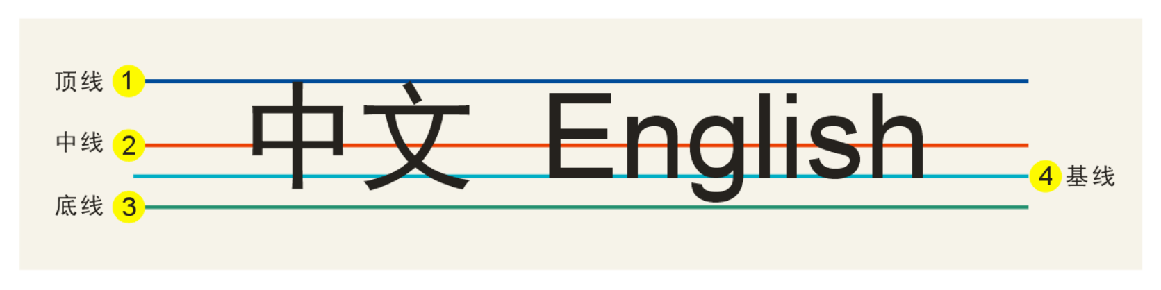
文本排版的几个基本概念:**顶线、中线、基线、底线**。`vertical-align` 属性中有 `top、middle、baseline、bottom`,与这四条线有关。
基线(baseline),指的是一行字横排时下沿的基础线,基线并不是汉字的下端沿,通常可以理解为英文字母 x 的下端沿。
### 字体高度、行高、行距和半行距
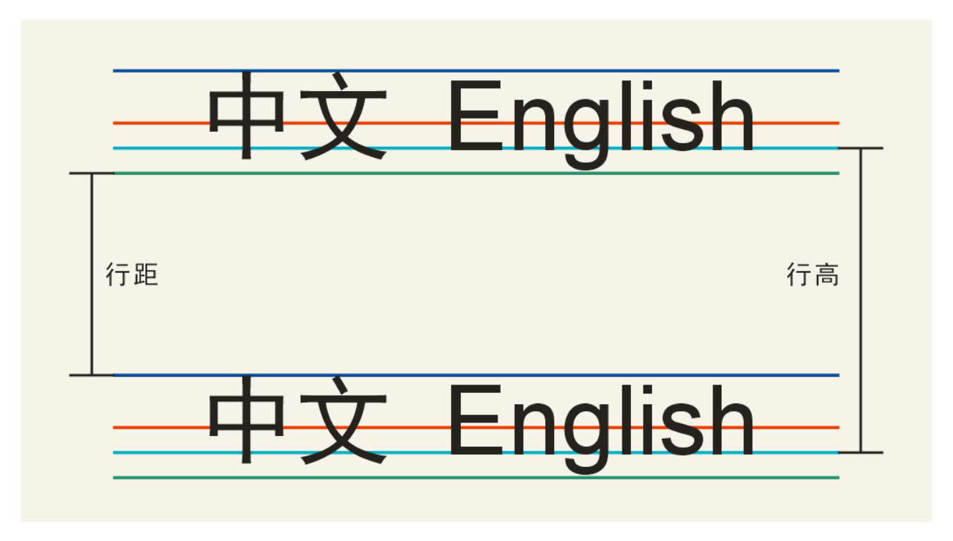
\*\*字体高度:\*\*顶线到底线的距离。我们,一般字体高度会大于或者等于字体大小,不同的字体会有差异。
**行高**:两行文本基线之间的距离。
\*\*行距:\*\*两行文本之间第一行的底线到第二行顶线的距离。**行距 = 行高 - 字体高度**
\*\*半行距:\*\*行距的一半。
### 内容区域、内联盒子、行框盒子、包含盒子
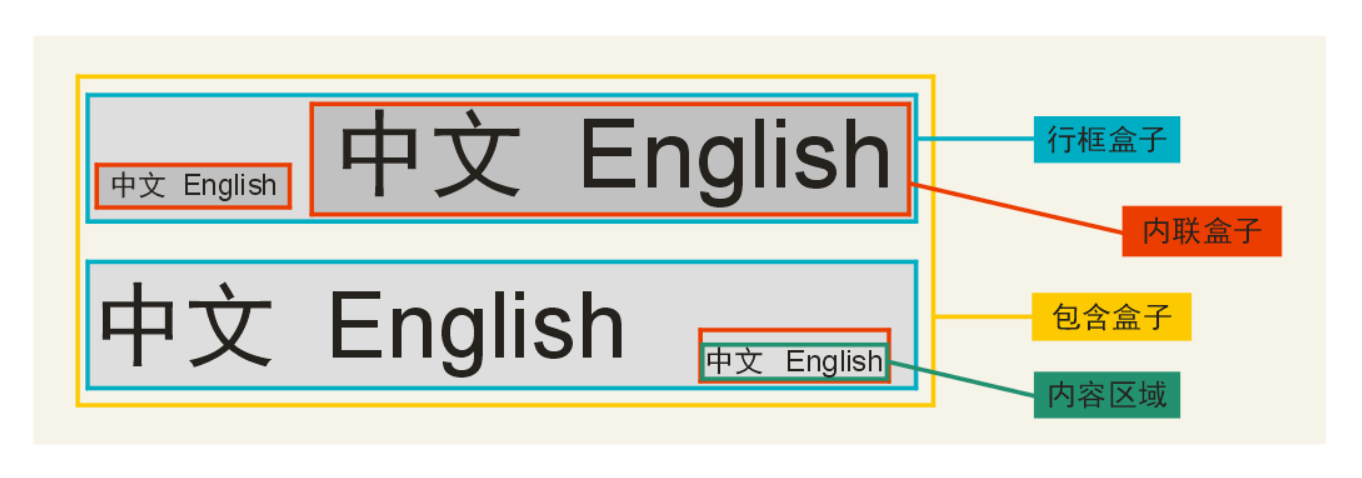
* **内容区域(content area)**:是一种围绕文字看不见的盒子。内容区域的大小与 `font-size` 大小和 `font-family` 相关,与 `line-height` 没有任何关系。[点击查看字体字号和盒子的关联](https://iamvdo.me/en/blog/css-font-metrics-line-height-and-vertical-align)
* **内联盒子(inline boxes)**:每个行内元素会生成一个行内框,行内框是一个浏览器渲染模型中的一个概念,无法显示出来。内联盒子不会让内容成块显示,而是排成一行。
如:外部包含inline水平的标签(span、a、em、strong等),则属于内联盒子。如果是个光秃秃的文字,则属于匿名内联盒子。行内框默认等于内容区域,除非设置了padding。
* \*\*行框盒子(line boxes):\*\*每一行就是一个行框盒子,每个行框盒子又是由一个一个内联盒子组成。行框盒子是浏览器渲染模式中的一个概念,无法显示出来。行框高度等于本行中所有行内框高度的最大值。当有多行内容时,每一行都有自己的行框。
* **包含盒子(containing box)**:由一行一行的行框盒子组成,**高度就是单行文本高度的累加**。
### 内联元素的高度表现
行高(line-height) = 内容区域高度(content area) + 行间距(vertical spacing)
行高决定内联盒子的高度;内容区域高度只跟 `font-size`、`font-family` 有关;行间距可大可小(甚至负值),保证高度正好等于行高。
行框盒子里面有多个不同行高的内联盒子,**高度并不是简单的由行高最高的那个盒子决定**,还需要考虑 `vertical-align` 属性值。
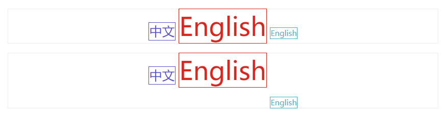
如下图:
上部分内联元素的高度:第一个 span: 28.4px,第二个 span: 54.8px,第三个 span: 18px。span 外层的包含盒子高度取决于第二个span,高度为52.8px(不包含 span 的边框)。
下部分内联元素的高度,与上部分完全一样。同时,给第三个 span 加一个 css 属性 `"vertical-align: -40px;`。span 外层的包含盒子高度为 **87.6px**(具体计算逻辑未知??)。
```html
中文
English
English
中文
English
English
```
[查看内联元素的高度DEMO](https://1927344728.github.io/demo-lizh/html/22-line-height.html)
另外,行间距为负值时,如果 `line-height` 小于 `font-size`,`inline box` 会优先于行高,以保证 `inline box` 的高度正好等于行高。
## line-height应用
### 单行文字的垂直居中对齐
一般来说,`line-height` 值设置为 `height` 一样大小的值,可以实现单行文字的垂直居中。实际上,`height` 是非必要的,删除`height` 单行文字也能居中的。

```html
```
[查看单行文字的垂直居中DEMO](https://1927344728.github.io/demo-lizh/html/22-line-height.html?type=2)
### 多行文字的垂直居中
高度不固定 `div`,多行文字垂直居中可以用 `padding`。
高度固定的 `div`,多行文字垂直居中可以借助于 `line-height` 来实现。

```html
盈盈一点芳心,占多少春光,问卿知否?红妆莫斗。谁得似、净骨天然清瘦。神娟韵秀。
盈盈一点芳心,占多少春光,问卿知否?红妆莫斗。谁得似、净骨天然清瘦。神娟韵秀。
```
> 注:span 标签要加 `display: inline-block`属性,或者改用块级标签。
>
> [查看多行文字的垂直居中DEMO](https://1927344728.github.io/demo-lizh/html/22-line-height.html?type=3)
### 图片的垂直居中
高度固定的 `div`,可以用 `line-height` 来实现不同高度图片的垂直居中。

```html
```
[查看图片的垂直居中DEMO](https://1927344728.github.io/demo-lizh/html/22-line-height.html?type=4)
## 相关问题
### img元素底部为何有空白?

```html
 wenqingzhifou?
```
[查看img元素底部空白DEMO](https://1927344728.github.io/demo-lizh/html/22-line-height.html?type=5)
在 HTML5 规范中有这样一句话:
> Each line box starts with a zero-width inline box with the element's font and line height properties. We call that imaginary box a 'strut'.
>
> 每个行框盒子都以一个具有元素的字体和行高属性的零宽度行内框开始。我们称这个假想的盒子为"支柱"。
在**HTML5 文档声明**中,内联元素的所有解析和渲染表现就如同每个行框盒子的前面有一个“空白节点”一样。这个 “空白节点” 永远透明,不占据任何宽度,也无法通过脚本获取,就好像幽灵一样,但又确确实实地存在,表现如同文本节点一样。也就是官方规范中的“`strut`”,在张鑫旭《CSS 世界》一书中根据其特点,称之为 “幽灵空白节点”。
也就是说,上述渲染结果与图片后面有文字是类似的:
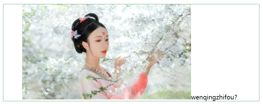
`img` 标签默认的 `display` 属性值是 `inline`,其后面的文本是由一个匿名内联元素包裹。图片和文本的垂直对齐方式是 `vertical-align: baseline`,即基线对齐。`img` 标签的基线是图片的下边缘,文本的基线一般认为是小写 `x` 的下边缘(上图中,为 `w` 的下边缘)。**图片与文本的基线对齐,而文本的行高中,基线到底线是还有一段高度的**,这段高度就是最终渲染出来的图片底部的空白。
**注意:** 底部空白的大小取决于文本行高,行高越大,则空白越大,反之亦然。由此也可知,行高为 0,则不会有空白。
这里的一个关键点是,**为什么 `img` 标签的基线是图片的下边缘?怎么来定位内联元素的基线?**
CSS2 的可视化格式模型文档中有一么一段话:
> The baseline of an ‘inline-block’ is the baseline of its last line box in the normal flow, unless it has either no in-flow line boxes or if its ‘overflow’ property has a computed value other than ‘visible’, in which case the baseline is the bottom margin edge.
这段话,我理解为:内联元素的基线是元素内正常流中最后一个内联元素的基线。如果,该元素里面没有内联元素,或者本身 `overflow` 属性的计算值而不是 `visible`,这种情况下基线是 `margin` 底边缘。
`img` 是单标签,其内部没有其他内联元素,所以它的基线是 `margin` 底边缘。
**常用解决方法:**`img` 标签加 `display: block`、`div` 标签加 `font-size: 0` 或者 `line-height: 0`、`img` 标签加 `vertical-align: top | middle | bottom` 等。
### 为什么line-height推荐使用无单位数字?
`line-height` 的取值有:1.5、150%、1.5em
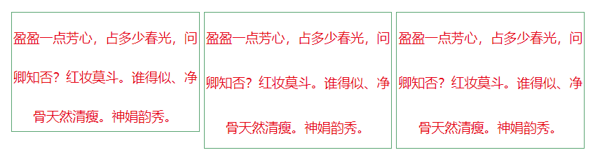
从计算上来讲,当前元素这三个`line-height` 的值是没有任何差别的。但子元素的 `line-height` 计算有差别:
* `line-height: 1.5`:子元素继承父元素 `line-height` 的系数,其具体值需要根据子元素的字体大小重新计算,即,子元素的 `line-height` = 1.5 \* 子元素的 `font-size` 值。
* `line-height: 150%/1.5em`:子元素继承父元素 `line-height` 的计算值,即,子元素的 `line-height` = 父元素的 `line-height` = 1.5 \* 父元素的 `font-size` 值。
由此可见:无单位时,子元素的行高随子元素 `font-size` 值变化(推荐使用);有单位时,子元素继承了父元素计算得出的行距,与子元素 `font-size` 无关。
```html
wenqingzhifou?
```
[查看img元素底部空白DEMO](https://1927344728.github.io/demo-lizh/html/22-line-height.html?type=5)
在 HTML5 规范中有这样一句话:
> Each line box starts with a zero-width inline box with the element's font and line height properties. We call that imaginary box a 'strut'.
>
> 每个行框盒子都以一个具有元素的字体和行高属性的零宽度行内框开始。我们称这个假想的盒子为"支柱"。
在**HTML5 文档声明**中,内联元素的所有解析和渲染表现就如同每个行框盒子的前面有一个“空白节点”一样。这个 “空白节点” 永远透明,不占据任何宽度,也无法通过脚本获取,就好像幽灵一样,但又确确实实地存在,表现如同文本节点一样。也就是官方规范中的“`strut`”,在张鑫旭《CSS 世界》一书中根据其特点,称之为 “幽灵空白节点”。
也就是说,上述渲染结果与图片后面有文字是类似的:

`img` 标签默认的 `display` 属性值是 `inline`,其后面的文本是由一个匿名内联元素包裹。图片和文本的垂直对齐方式是 `vertical-align: baseline`,即基线对齐。`img` 标签的基线是图片的下边缘,文本的基线一般认为是小写 `x` 的下边缘(上图中,为 `w` 的下边缘)。**图片与文本的基线对齐,而文本的行高中,基线到底线是还有一段高度的**,这段高度就是最终渲染出来的图片底部的空白。
**注意:** 底部空白的大小取决于文本行高,行高越大,则空白越大,反之亦然。由此也可知,行高为 0,则不会有空白。
这里的一个关键点是,**为什么 `img` 标签的基线是图片的下边缘?怎么来定位内联元素的基线?**
CSS2 的可视化格式模型文档中有一么一段话:
> The baseline of an ‘inline-block’ is the baseline of its last line box in the normal flow, unless it has either no in-flow line boxes or if its ‘overflow’ property has a computed value other than ‘visible’, in which case the baseline is the bottom margin edge.
这段话,我理解为:内联元素的基线是元素内正常流中最后一个内联元素的基线。如果,该元素里面没有内联元素,或者本身 `overflow` 属性的计算值而不是 `visible`,这种情况下基线是 `margin` 底边缘。
`img` 是单标签,其内部没有其他内联元素,所以它的基线是 `margin` 底边缘。
**常用解决方法:**`img` 标签加 `display: block`、`div` 标签加 `font-size: 0` 或者 `line-height: 0`、`img` 标签加 `vertical-align: top | middle | bottom` 等。
### 为什么line-height推荐使用无单位数字?
`line-height` 的取值有:1.5、150%、1.5em
从计算上来讲,当前元素这三个`line-height` 的值是没有任何差别的。但子元素的 `line-height` 计算有差别:
* `line-height: 1.5`:子元素继承父元素 `line-height` 的系数,其具体值需要根据子元素的字体大小重新计算,即,子元素的 `line-height` = 1.5 \* 子元素的 `font-size` 值。
* `line-height: 150%/1.5em`:子元素继承父元素 `line-height` 的计算值,即,子元素的 `line-height` = 父元素的 `line-height` = 1.5 \* 父元素的 `font-size` 值。
由此可见:无单位时,子元素的行高随子元素 `font-size` 值变化(推荐使用);有单位时,子元素继承了父元素计算得出的行距,与子元素 `font-size` 无关。

```html
盈盈一点芳心,占多少春光,问卿知否?红妆莫斗。谁得似、净骨天然清瘦。神娟韵秀。
盈盈一点芳心,占多少春光,问卿知否?红妆莫斗。谁得似、净骨天然清瘦。神娟韵秀。
盈盈一点芳心,占多少春光,问卿知否?红妆莫斗。谁得似、净骨天然清瘦。神娟韵秀。
```
[查看line-height单位DEMO](https://1927344728.github.io/demo-lizh/html/22-line-height.html?type=6)
上面的三个 `li` 元素的 `line-height` 计算值都是 `30px * 1.5 = 45px`。而第一个 `li` 下的 `span` 的 `line-height` 计算值是 `1.5 * 15px = 22.5px`,其余两个 `li` 下的 `span` 的计算值是父元素的 `line-height` 计算值,即 `45px`。
### line-height 在内联元素和块级元素作用区别
* 非替换元素的纯内联元素:如纯文本元素,高度完全由 `line-height` 决定,即,内容区域高度(固定高度) + 行间距(不固定高度)。`line-height` 之所以起作用,就是通过改变行间距来实现的。
* 替换元素:如:`img、iframe、video`,`line-height` 只能决定最小高度。
* 块级元素:`line-height` 对其本身是没有任何作用的。但在块元素没有指定高度时,它可以改变块级元素里面内联元素占据的高度来影响块元素高度。
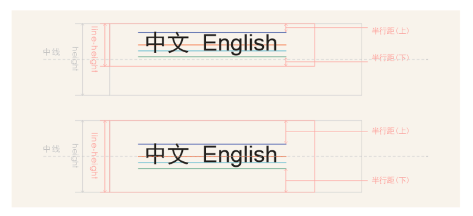
### 为何line-height可以让单行文本垂直居中?
在CSS中,如果我们把一段文本的 `line-height` 设置为父容器的高度就可以实现文本垂直居中。
那么,它怎么实际垂直居中的呢?
默认情况下一行文本的行高分为:上半行距,内容区域的高度,下半行距,并且上半行距是等于下半行距的。当`line-height`增大,内容区域的高度不变,上下行距增大(且保持相等),文本区域的位置往下移;当 `line-height` 值与 `height` 相等时,可以近似的看成内容区域垂直居中于父容器。
## 参考资料
[MDN line-height](https://developer.mozilla.org/zh-CN/docs/Web/CSS/line-height)
[张鑫旭 css行高line-height的一些深入理解及应用](https://www.zhangxinxu.com/wordpress/2009/11/css%E8%A1%8C%E9%AB%98line-height%E7%9A%84%E4%B8%80%E4%BA%9B%E6%B7%B1%E5%85%A5%E7%90%86%E8%A7%A3%E5%8F%8A%E5%BA%94%E7%94%A8/)
[CSS深入理解之line-height](https://juejin.cn/post/6844903721025929223)
[css line-height 用法详解](https://blog.csdn.net/weixin_41275295/article/details/104443808)
[Deep dive CSS: font metrics, line-height and vertical-align](https://iamvdo.me/en/blog/css-font-metrics-line-height-and-vertical-align)