# 纯CSS绘制箭头
用CSS即可绘制出各种箭头,无需裁剪图片,甚至没有用到 `CSS3` 的东西。对浏览器支持良好。
## 边框箭头
原理非常简单,通过截取`border`的部分“拐角”实现

```html
```
[查看DEMO](https://1927344728.github.io/demo-lizh/html/09-arrow.html?type=1)
## 实心箭头
当元素宽、高为零,且其他边为透明颜色时,可以形一个三角形。改变各个边的宽度,即通过调整“边框”厚度可以配置出任意角度

```html
```
[查看DEMO](https://1927344728.github.io/demo-lizh/html/09-arrow.html?type=2)
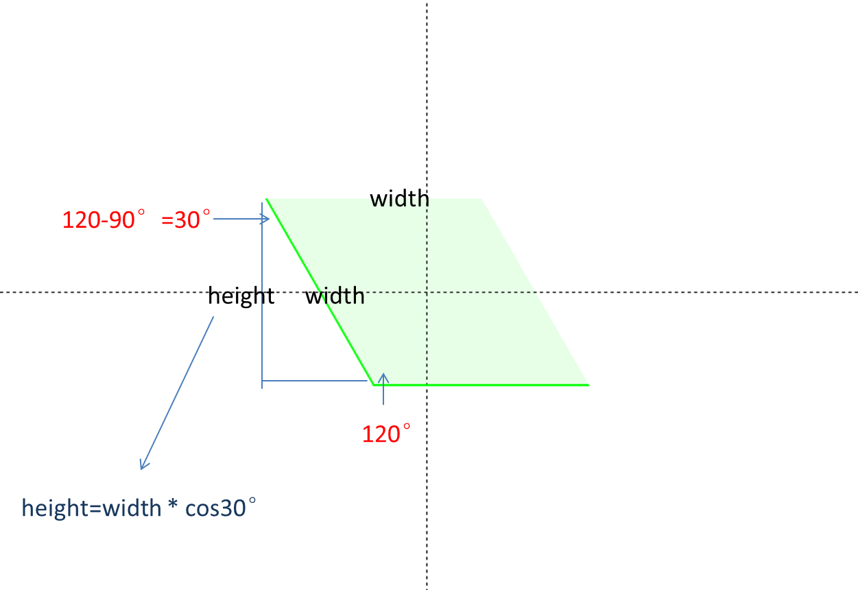
## 90°之外的箭头
常见的箭头设计是大于90°的,在上面例子的基础上,“压扁”或“拉长”矩形不就可以了吗?而“压扁”或“拉长”需要用`skew()`就能实现,只不过需要做些角度的计算。 按照`width: 100px;` 角度120°的需求来定义边长、角度两个变量。`height = width * cos(30°) = width * sin(60°)`。

```html
```
[查看DEMO](https://1927344728.github.io/demo-lizh/html/09-arrow.html?type=3)

```html
```
[查看DEMO](https://1927344728.github.io/demo-lizh/html/09-arrow.html?type=4)
## 终极实现方法
`transform: matrix`实现任意大小,任意方向, 任意角度的箭头 。
先把div 旋转45度, 让它成为一个 菱形 然后再伸缩,达到任意的角度, 这样就可以得到一个 任意角度的箭头。由于用到了旋转和伸缩两种变换,所以需要使用 `transform: matrix(a,b,c,d,e,f)` 这个变换矩阵。

```html
```
[查看DEMO](https://1927344728.github.io/demo-lizh/html/09-arrow.html?type=5)
(没看懂。感兴趣的可以点击下方链接查看。lizh)
## 参考链接
[css箭头](http://www.php-master.com/post/44097.html)
[使用css实现任意大小,任意方向, 任意角度的箭头](https://juejin.im/post/5a9c99c4f265da23906b7c98)
---
# Agent Instructions: Querying This Documentation
If you need additional information that is not directly available in this page, you can query the documentation dynamically by asking a question.
Perform an HTTP GET request on the current page URL with the `ask` query parameter:
```
GET https://lizh.gitbook.io/knowledge/research/chun-css-hui-zhi-jian-tou.md?ask=
```
The question should be specific, self-contained, and written in natural language.
The response will contain a direct answer to the question and relevant excerpts and sources from the documentation.
Use this mechanism when the answer is not explicitly present in the current page, you need clarification or additional context, or you want to retrieve related documentation sections.